Executive Desks & Offices
Veneer, Solid Wood & Stone: A Guide to Premium Desk Materials
At the executive level, the material makes the desk. What distinguishes wood veneer, solid wood, and stone, and how to...
Read more →
Matching Sets
Executive Desks & Offices
Choosing an executive office palette is three decisions: dark or light, the wood tone to build around, and a single accent. How to make a room read as one intention.

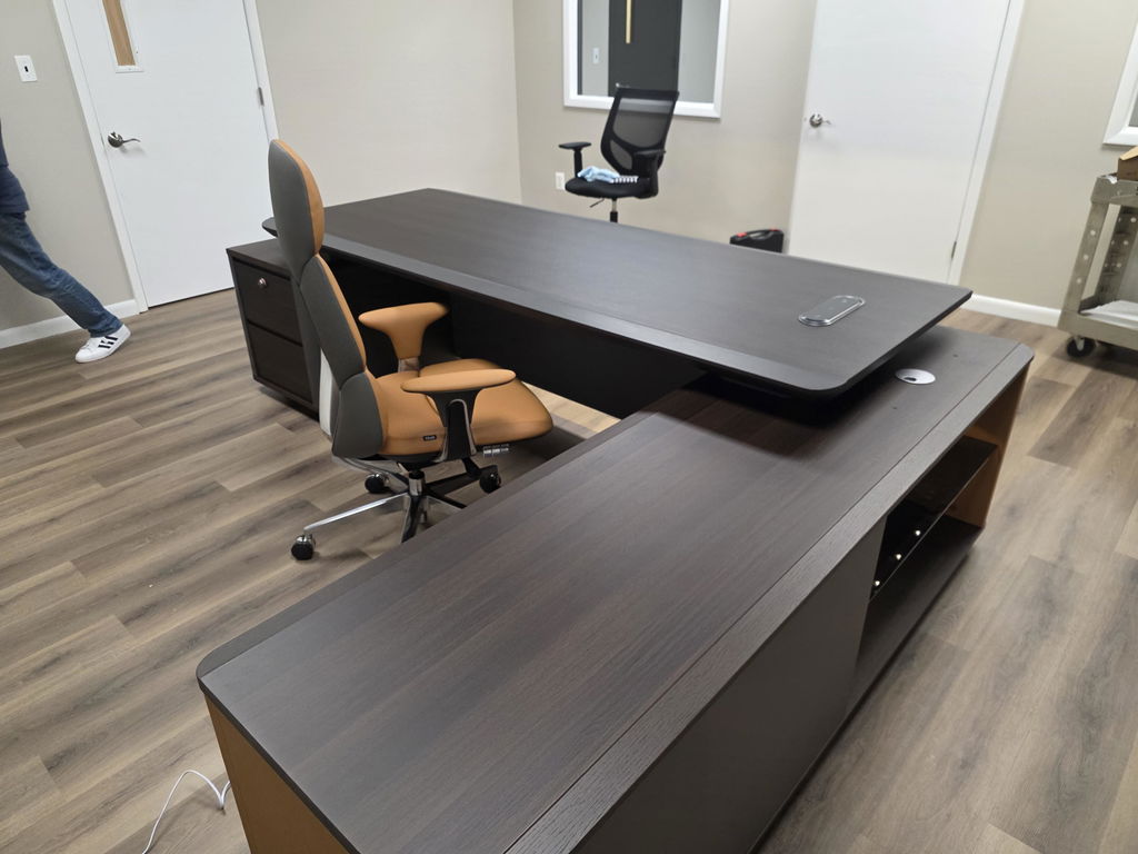
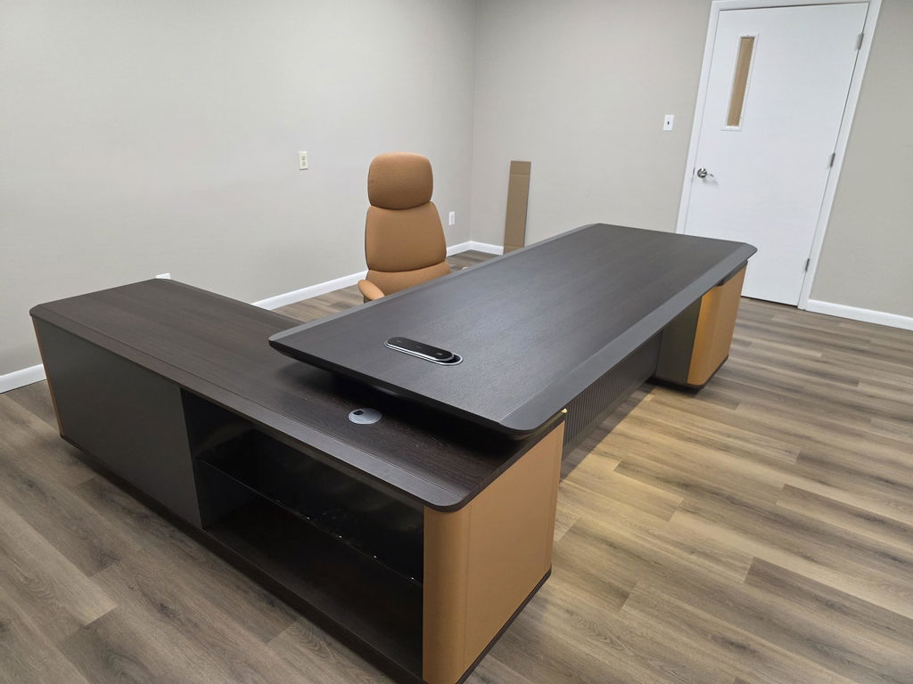
Choosing a color palette for an executive office comes down to three decisions in order: dark or light overall, the wood tone you'll build around, and the single accent you'll allow. Get those right and the room feels coherent and considered; skip the sequence and you end up with finishes that don't quite agree. Color is the first thing anyone reads in a room, so it's worth deciding on purpose.
Most offices get their color by accident, a desk chosen here, a paint color there, a chair that seemed nice in the showroom. A palette is simply the decision to choose them together, keyed to one another, so the room reads as one intention.

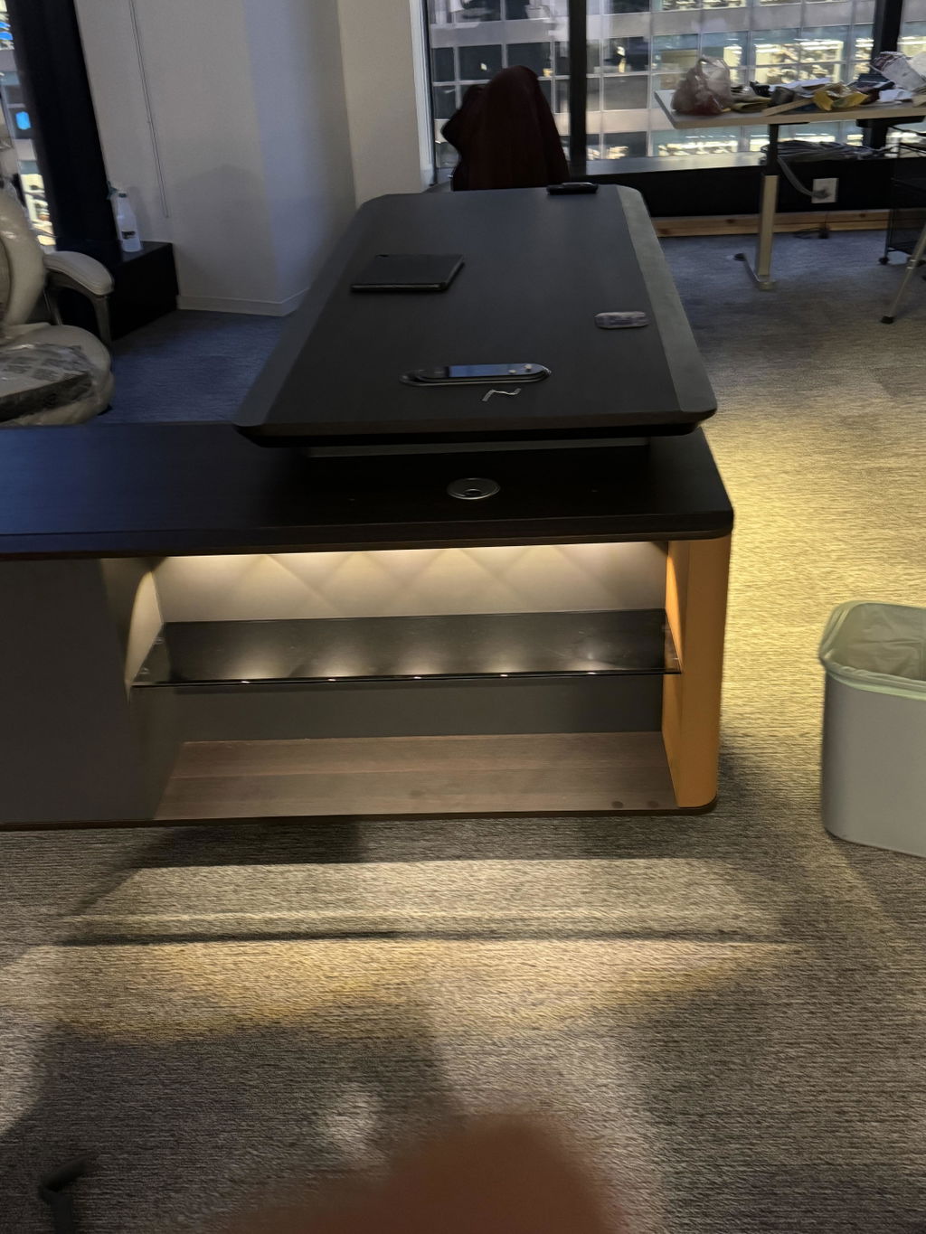
The biggest lever is overall value. A light palette, pale walls, light wood, soft neutrals, reads as open, calm, and spacious, and it flatters a smaller or lower-lit room by making it feel larger. A dark palette, deep walls, rich wood, moody tones, reads as focused, intimate, and dramatic, but it needs good layered lighting and enough daylight to carry it. Choose by the room you have: dark rewards a generous, well-lit space; light rescues a tight or dim one.

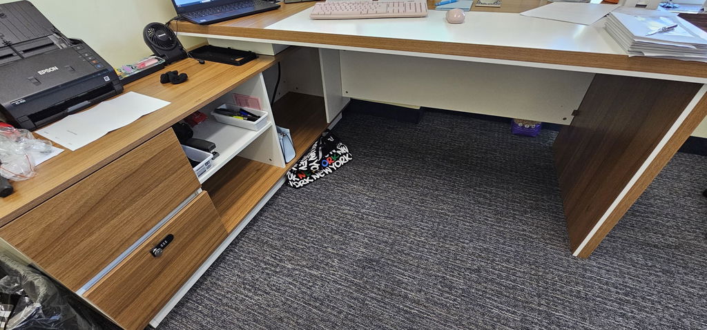
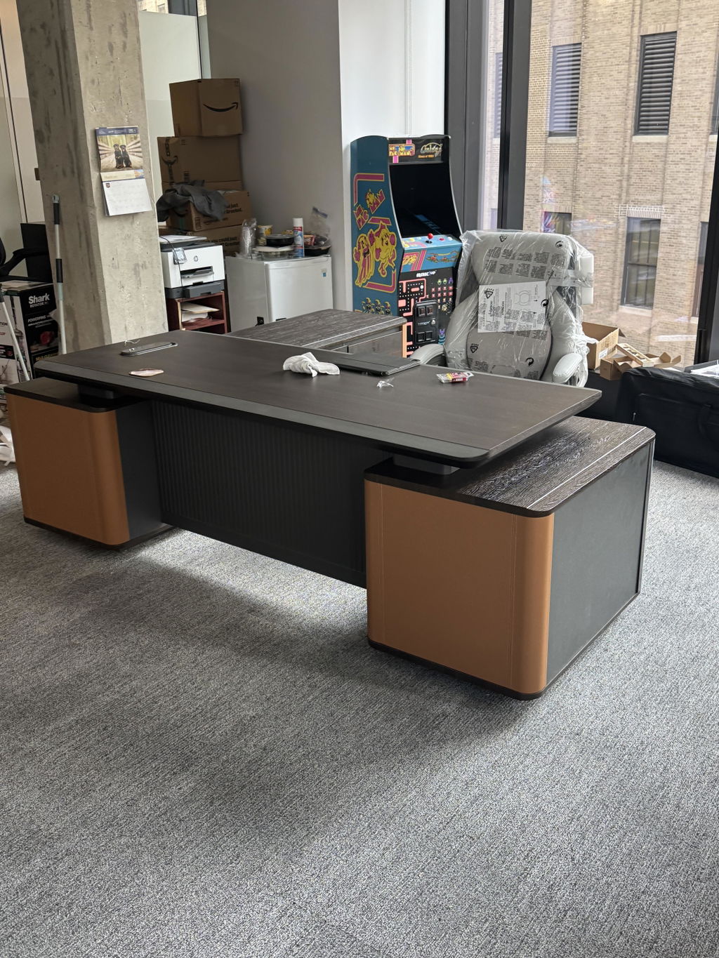
The desk is usually the largest wood surface in the room, so let its tone anchor everything else. Warm woods, oak, walnut, teak, pull the palette toward earthy neutrals: cream, tan, olive, warm gray. Cooler or gray-toned woods sit better with cooler neutrals and crisper whites. Decide the wood first, then choose wall colors, flooring, and textiles that agree with its temperature rather than fighting it. This single move prevents most palette mistakes.
Coherence doesn't mean everything the same color. Aim for one wood tone and one metal carried across the desk, storage, and details, with walls and textiles a shade or two that complement rather than copy. Matching every element exactly looks flat; keeping them in one temperature family looks designed. The goal is agreement, not uniformity.
A single accent color gives the room life without breaking its calm. Pick one, forest green, deep navy, oxblood, or a warm metal like brass, and use it in one or two places: a chair, a rug, a piece of art, the spines on a shelf. Restraint is the whole point; two or three accents compete, one accent reads as a considered choice.
The same finish looks different depending on the light. North-facing rooms get cool, even light that can make grays and whites feel flat; south and west light runs warm and can push a warm wood toward orange. Always judge finishes in the actual room, at the times you'll use it, before committing. A sample that looks right in a showroom can read very differently on your wall.
A palette is easiest to hold when the pieces are made to share it. Arc Grove® offers executive furniture across a wide range of woods and finishes, matched across the desk, storage, and seating, so the whole room is drawn from one coherent set of tones rather than assembled from separate catalogs. Build your palette, or see how it fits the room in our guide to designing an executive office.
Related articles
Executive Desks & Offices
At the executive level, the material makes the desk. What distinguishes wood veneer, solid wood, and stone, and how to...
Read more →
Executive Desks & Offices
With more than 150 finishes to choose from, the way to a coordinated office is a simple sequence: pick one...
Read more →
Executive Desks & Offices
A home executive office should be as considered as the one at headquarters. How to design a serious, presence-carrying space...
Read more →